
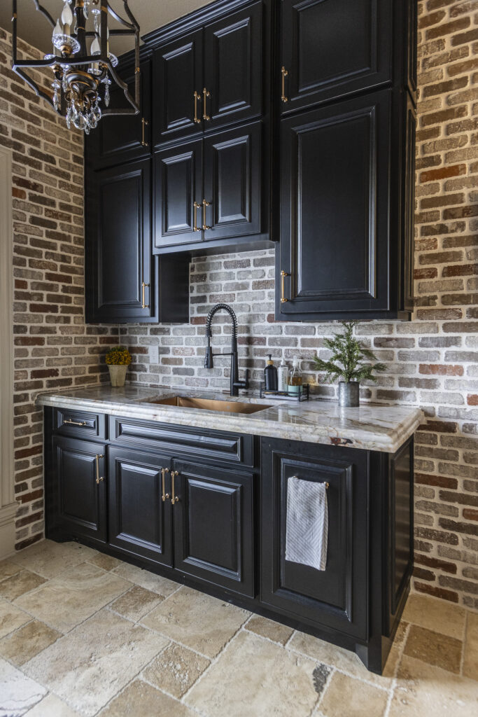
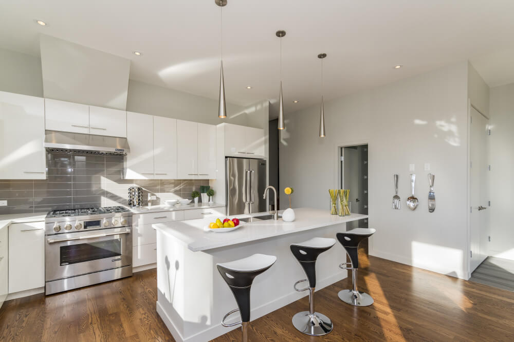
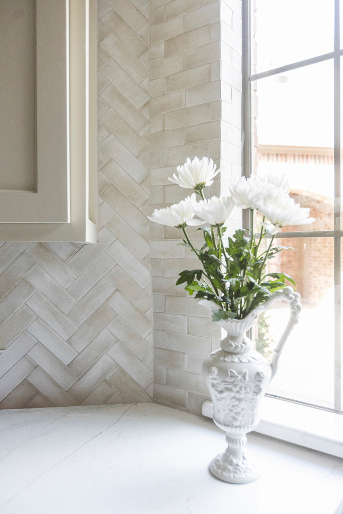
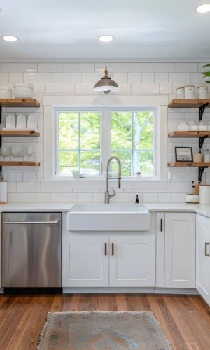
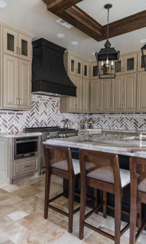
Kitchens have a lot of visual elements — cabinets, countertops, appliances, lighting, wall space, tile, décor, and more. Without balance, things get busy fast.
The 60-30-10 rule:
 Keeps your color palette consistent Prevents the kitchen from feeling cluttered or chaotic Helps you confidently choose backsplash colors Allows bold accents without overwhelming the space Works for any design style — modern, farmhouse, traditional, transitional, etc.
It’s one of the easiest design principles for homeowners to use, and it always creates a polished, intentional look.


Julia Dobbins
21:49 26 Feb 25
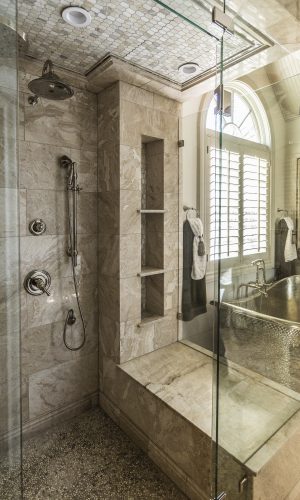
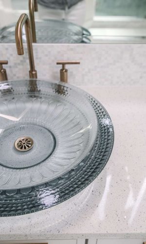
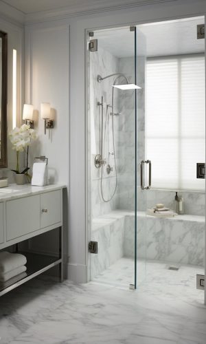
We recently used Edward and his crew to convert our builder-grade tub into a walk-in shower and to add backsplash in the kitchen, and we couldn't be happier with the results! Edward was incredibly professional throughout the entire process. He was proactive, communicative, and kept us updated on the progress of the work. The attention to detail in both the shower and backsplash was impressive. The pricing was very competitive with other local contractors, and the quality was unmatched. The final outcome exceeded our expectations. I highly recommend Legacy Home Care for any home renovation project!

Dana Morton
19:04 23 Feb 25
I highly recommend Legacy Home Care. Very professional, completed all the work we expected and additional touches they suggested which made the overall project beautiful when they finished.

Tracie Byrd
15:45 23 Jan 25
Super thankful for Edward and his team doing an awesome job on our commercial project! The communication was top-notch. There were a few bumps in the road, as expected, but everything ended perfectly. Appreciate your guidance and professional advice. You deserve an award juggling all the balls in the air with our rushed timeframe to complete the job. Great work! You and your crew, 5 stars!

Ghazi Saleem
19:41 22 Dec 24
Edward and his team are professional and knowledgeable. We had some damage from a leak. They started on time, finished on time and did an amazing job! Would definitely hire them again!!

Sarah Owen
15:20 13 Dec 24
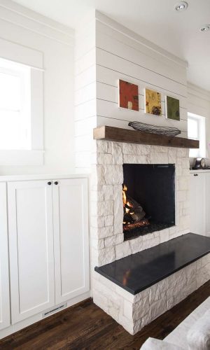
Legacy Home Care did a full renovation of our kitchen down to the studs and hardwood flooring throughout the downstairs after a dishwasher leak. The craftsmanship of each element is extremely high quality. The other amazing thing is that the project stayed on schedule. Edward was very helpful in working with our insurance company and helped us receive more on our claim than we would have on our own. As with any full renovation, there were tense moments but Edward always sought to make things right and assured we were happy down to the very small details. We would use Legacy Home Care again and recommend them to friends.

Roy Cook
03:21 07 Dec 24
Edward is one of the most professional guys in the industry. He is kind, courteous, and knowledgeable. Quality work and exceeds expectations on both the work and communication.

Chelsey Summers
19:26 25 Oct 24
I met Edward through our local networking group and although I haven't used Legacy Home Care's services, I can attest to Edward's character and integrity in the group. His personable and professional approach to networking has added value to our group. He is a great connector, always thinking of ways he can connect people in meaningful ways. Edward's experience and knowledge as a seasoned business owner positions him as a leader among the members. It's been a pleasure getting to know Edward and seeing his passion for his business. It's evident that Edward's skills, passion, and drive set him apart in his industry!


Trey Rush
23:01 23 Oct 24
Edward with Legacy Home Care in McKinney does incredible home remodeling work. The attention to detail and craftsmanship is top-notch. From kitchens to full home makeovers the Edward is my go to from now on. If you're looking for a reliable company to handle your remodeling needs, Legacy Home Care is definitely worth considering."

Michael McNaughton
21:00 18 Jul 24
I had a great experience with Legacy Home Care. I had water intrusion that caused damage to drywall, carpet and baseboards in our primary bedroom and closet. We decided to upgrade the closets shelving during the repair. Edward really listened to what we wanted and his guys showed professionalism and extreme skill in their trades. The entire process was clearly communicated and the work areas were never left in disorder at the end of the day. I highly recommend this company.